Tuesday, February 28, 2012

Game Art

Today was the release day of my PC game, Flatspace IIk. It's a simple game set in space where players begin with a small ship then have the freedom to fly about, trade cargo, explore, chase criminals or become them. Freedom is the important word for the gameplay.

The game is an update to Flatspace II. I'd got a little tired with the current sales system of the old game and for a variety of reasons, something new that had the best of what had come before, with more and cheaper, was the best option. When the project gained momentum I knew that tweaking the look would be important. This one has a definite red/copper look to it. The first game was very blue and green. Orange and green made up the second game, and the enemies in that one were the orange component. For Flatspace IIk, I settled on red pretty quickly and began to like it more and more.

One key feature of the new game is the ability to create or modify the items in the game universe. It's a complex game and you can buy or sell products of different sorts (like "Minerals" or "Fruit/Vegetables"). Players can now make their own categories. In fact along with the freedom of play, freedom to create has been in the back of my mind for years, since before the second game.

I think it's fair to say that the game has a "cult following". This tends to mean than a small number of people like it a lot, rather than lots of people broadly like it. Had the games been a commercial success I might probably have not become an artist. Now there's a thought.

Some of my best work is in computer code form but ironically only a computer can really appreciate it. Programming can be like trying to please someone who is really sensitive to the slightest mistake. It's excellent training for those who seek perfection, but it's hard to read and hard to display. One flaw of anything to do with computers is that most people have no idea how easy or difficult something is, and not even the best expert can really know by only seeing end results. One nice thing about painting or any developed skill like stone carving, is that the effort becomes more obvious, and so does the satisfaction.

As an artist who used to develop games do I think games are an art form? Well, they have many creative aspects, but the ability for self-expression is often constrained by the need to make the game enjoyable. For most art, perhaps all art, self expression is the key component. Even something vast and complex that involves hundreds of people like the film "Avatar" expresses a feeling and perspective of mostly one person, James Cameron, but in games I don't really feel that. It's because once the visuals and music is taken care of, the other aspects of a game are necessarily constrained by gameplay.

I've no plans to go back to game development and Flatspace IIk might be my last game, but who can say. The nice thing about the future is that anything can happen. I expect that one day, when I'm a rich artist relaxing in my palatial new museum-mansion, a big fat publisher with glittering gold rings will offer me a zillion pounds to develop a new and fantastic sequel to Flatspace, and when it happens I'll ask them where they were in the 1990's. And then say yes.

Flatspace IIk costs $16 US and if you have a Windows you can give it a try.

Monday, February 27, 2012

Micro-update

I started writing a story called The Many Beautiful Worlds of Death today. I'm finding writing easier than I used to. I think that the act of reading Flowers for Algernon has made me a better writer by some curious adaptation! Reading about someone who becomes increasingly intelligent and literate, and experiencing the method of writing in the story, which grows from using simple language to using more complex literary forms and vocabulary, might have helped. It's that or just enjoying reading a book, which I often did at a whisper. I find that I absorb and enjoy reading more when I mouth or speak the words. Is that just me?

Friday, February 24, 2012

Plans

I've been planning paintings over the past few days and have got three or four just about ready. The last step is determining the size. Ideally I'd paint each one big, but any over 1M will exclude them from most competitions and open exhibitions. Much larger and framing is too difficult too; they wouldn't fit into a car. Then storage space. The painting time is perhaps the last concern because with a canvas texture there isn't necessarily more work involved with a large work. A large painting on panel though can take a long long time.

That said I've got so so many painting ideas noted that I really have to try and get through the good ones. I need to keep coming up with new ideas to avoid getting rusty too, yet when I look through my ideas book I see so many paintings that I think deserve making. But why? And which to choose?!

Here's a page from my book...

These ideas are more mnemonics to myself of visual ideas than actual drafts or preparitory sketches.

Some ideas that are visually spectacular, and some are simpler than others. Some are about the world or the environment. Some are about internal thoughts and feelings or human psychology. Some are about philosophical ideas, like "To Know Both Sides Of An Equation Absolutely Would Cause Logic To Fail" (below). Which ideas are best? I try to have a mix.

Then some are easier to paint than others. Some represent a realistic 3D environment. Some are definitely 2D and some less than 2D, using lines so form shapes and boundaries, or crossovers. I tend to paint the ones with a workable 3D environment, although I've painted the odd one from other categories too. "Trying to Ignite Love" is a crossover from last year. "The Uncertain Mind/Reality Gap" below is a 2D example too. The 2D ones are harder to plan and paint because of the lack of modellable imagery to copy from. There are lines and definite shapes but no mass, no shading, no solidity or colours to go in all of that "nothingness". "Love, Sex and the Vasovagal Reflex" on the ideas page above is a good example of a difficult painting to paint for reasons like that, it's a mix of 2D and 3D elements; a 2D flow that demands freedom of expression within the line but with physical forms which demand 3D technical accuracy.

For the time being I'll try for a mix, and try more of the "difficult" 2D paintings. Everything difficult is fun and everything easy is boring. I've decided to prepare five, paint them, then re-examine for a next lot of ideas. I've discovered on previous years that too much planning makes the year tedious and kills the creative factor. I think the first is going to have to be "Tiger Moving Nowhere At All" which is about the fate of this moribund species, and is for a competition.

Tomorrow though I must plan the Love Symphony performance extravaganza, and perhaps make props. Oh, in other news I can now officially say I've founded a book publishing business, Pentangel Books. We specialise in expensive highbrow art poetry books, and any other sort of book at all especially ones that will sell millions of copies. My first release will of course be, 365 Universes and be in two editions released on April 23rd.

Monday, February 20, 2012

Tick

I'm very weepy after finishing Flowers for Algernon. What a brilliant book. I'm inspired to write something, if only, like Charlie, I had the time.

A many simple jobs today and I began to list them but stopped.

My daily regime now involves a walk or cycle ride for exercise, 2 cups of coffee per day, 4 cups of green or white tea, and some mental training which today was reading a page of Spanish and Swedish, which of course I couldn't manage at all, but enjoyed trying. I wish I'd done this years ago instead of now. The downside to this book is that I can see the huge amount I've lost over the past 5 years. I now sleep for exactly 8 hours each night and try to regulate my circadian rhythms with lighting. That appears to work.

Onward.

Sunday, February 19, 2012

Flowers for Algernon

Today I designed the layout and posters for my May exhibition at Sevens of Macclesfield. I also finalised the layout for the Crewe Hall exhibition in April and designed the poster for The Love Symphony Performance. I designed a good frame today by pouring plaster over it and dimpling it with a ploythene sheet. When dry it looked a bit like mountain rocks, which was the aim. It cracked somewhat as I dried it. I'm undecided whether to coat it with epoxy resin to reinforce it, or use acrylic media which would be less strong but colour the plaster in a less shiny way (paint over epoxy doens't always wrok brilliantly). Within a week I will found a book publishing business.

I'm reading Flowers for Algernon by Daniel Keyes after listening obsessively to A Curious Feeling by Tony Banks. Both things are lovely and inspiring. My emotions are Sirius B and my mind is Sirius A, and the thin stream of matter that flows from one to the other is vaporous and convoluted enough to spare me too much sadness, I have never experienced depression, or too much happiness either, yet that tentacle of matter is as sensitive as any nerve ending. The tentacle connected during a fantastic and emotionally overwhelmingly lovely dream that occured on the 25th of September 2008. Before then I didn't really require emotions. This book makes me wonder if it would be wise or foolish to feel the burning radiation of Sirius B more strongly. I feel blessed.

Enough introspection for now. This must be my greatest year, and indeed, it is already. I'm blessed to have it. I'm blessed to have even today, this great day. This book also convinces me that I must write a novel.

Saturday, February 18, 2012

The Love Reliquary Complete!

I now consider my Love Reliquary complete. Last summer I took part in my first arts festival and the variety of work on show plus a BBC documentary about medieval reliquaries inspired me to make my own reliquary. I wanted to do so as much for the technical challenge as anything else; I knew it would be a learning experience.

The doors caused the greatest problem at first. How to make a very symmetrical arch that matched exactly. There were many options and I did lots of experiments but in the end settled on plaster arches reinforced with epoxy casting resin. The inner edges were covered with veneer and I had to work out how to flatten that too. The side strips (which you can't really see) are aluminium which I decorated with shellac ink and then etched using copper sulphate. Everything was stuck together. Then came the front doors...

They involved plaster sheets, very delicate pieces and caused me the greatest hardship! So often did the plaster leak but in the end I worked out how to make a mould using glass parts and aluminium struts and latex to plug any gaps. After lots of failures I managed to cast a few large sheets that were smooth as glass on both sides. Once dry those had more plaster on top and air dried clay. They were then reinforced with epoxy, carved and stuck onto the doors. Then the cabinet was varnished

The last stage was the gilding and that was probably the most difficult. There are over 100 sheets of 24ct gold on there. Gilding requires a lot of skill. The size (the "glue", that is) has to have just the right level of tack or it won't dry, and handling gold leaf isn't easy. In the end I had to apply two layers, which covered the object well but left the surface wrinkled, unfortunately obscuring many fine details like the etched decoration and the poem on the front. If I had a second chance I'd do this part better.

The paintings were the easiest part for me, and were on panels cut to fit the cabinet. The last object was the silver jewel object which is held in place with a magnet. Here are some close-ups...


The object tells the story of a relationship from start to finish. The left panel is the man as an angel. The right is the woman as Rapunzel in her tower (the heart shaped hole reveals the jewel inside). The central panel shows the lovers, cracked and overgrown like a memory, but still beautiful and eternal. The object is then love preserved, an emotional relic.

I'd like to make this again, or something like it. I know that if I made another it would come out better. Such is the way with skills. Overall this took about 6 months to make. It's about 30x50cm and weighs a lot! I've made a custom stand for it, and will have to make a case for transportation. What to do with it now? I've not decided. I'll enter it into a competition as a sculpture, I imagine. For now I'm focused on the next job; plans for the ordinary paintings of 2012.

There is more information about the paintings in the gallery section of my website, and some more pictures of the cabinet in the sculpture section.

Friday, February 17, 2012

Publishing and Crewe Hall

Here's a 3D computer model of the exhibition area at Crewe Hall, where I'm due to exhibit at in April. I measured it yesterday somewhat rapidly! I always make a computer model of the venue before an exhibition and layout the paintings before hand. It's one case where it saves time to use computers (often paper is faster).

Wednesday, February 15, 2012

Jewellery

A quick update to show you the silver-work I've made for my "reliquary", which is just about finished now. The next step is to photograph it and add it to my website. This is silver with a red sapphire and a big champagne cubic zirconium gemstone.

Tuesday, February 14, 2012

The Love Symphony Released

Happy St. Valentines day to you! Today The Love Symphony is released. I began writing this in December and is my first major piece of music in a few years. Often for music I'd gradually accrete tracks, then fit them together to match the mood and theme but this time I designed the feeling and story from the start and decided to write music to fit; much more like the way I paint.

The music is a story from loneliness to love, a growth from nothing to joy in a not-at-all-hidden homage to Beethoven's 9th symphony; although in negativity I prefer sadness to anger because it's more romantic, and in fact I love it and my favourite films are weepies. The music!

Here is the cover...

The music is divided into three sections. The first was about growth or searching, from emptiness, and then a dream of love, which was based around a simple melody and triplets of notes. This sounded most Vangellisian, quite by accident and was originally called The Door in the Sky, and the image I used was a door in a sky-blue roof of a cave filled with an underground ocean, like the sunless sea referred to by Coleridge. The image was of the door opening, which is why the start sounds like a hiss, like the release of steamy gasses when doors open in space in sci-fi films (of course, sound doesn't actually travel in space at all anyway, not sure why I imagine a clear space-door "hiss"). When opened I walked along the sky upside down, and flew in the air over the ocean, and that instantaneous image was the basis for the music.

The middle section was about loneliness and then finding inner peace, which became empty. The main track was actually the first written and so sounds different in instrumentation than the others. It's simple musically, a soulful melody in one chord like a lost snake, then pretty and warm and wide chords to contrast it. Then I added a melody to go with the chord part and swapped the size/space of the verse and chorus before a finale which included everything. It ended so beautifully that it didn't fit the mood needed for that part of the album, so I added the flute again at the end, and suddenly the instrument realises the falseness of this narcissism, the pretty chord-part now represented God. When I'd worked that out I added the previous track, Encounter with the Believers, in which the main flute was inducted into a religion.

The final section begins with a harp which sounds oriental but which was supposed to be masturbatory, then a melody also in harp which has now become the protagonist. The flute is the object of affection, a chance encounter, and the two instruments chat to each other then get to know each other. The melody is simple, it starts as a sad version of the main tune in the glorious finalé, and gradually the flute and harp in dialogue grow to and move towards that finalé. The tune ends with a moment where the eyes of both tunes seem to meet, that's it, they've fallen in love.

That long tune at the end was one of the first written, but I thought it would be a nightmare to sequence and balance. I was wrong! and it all worked so well that I had all of the important parts noted down in one day. I always wanted the beginning to start with glorious alarms, church bells peeling and an explosion. The ending too I had worked out, with something quiet and happy and content and beautiful, not a big "pomp" or bang but gentle and lovely.

I ended up writing a lot more than ended up in the album, but I'm happy enough with what's here and I like it as much as I liked The Spiral Staircase, which I always liked a lot.

The music is available to order by download or on CD from www.marksheeky.com, and available by download from Amazon, Tidal, iTunes and by other distributors.

Monday, February 13, 2012

MMU

Tomorrow is the release date for The Love Symphony, the music so hard worked on in December. I thought it would be nice to have some sort of performance or live première, and a quick mention of this led to one thing and then another and as a result I had a quick meeting today a few students at the local campus of Manchester Metropolitan University, with an aim to putting on performance to accompany the music.

It went well and I'm excited about trying some performance art for the first time. I want beauty to be the heart of it, to make something that isn't a weird avant garde show in any respect apart from innovation and general amazement!

My poetry book is just about complete. I've added lots of the small token images but not everyone thinks it's a good idea because these paintings are not like my type of art. I'm unsure. On balance I'd rather add more content than less, and the colours, I think, make it special. Either way, this is one book and not a long term change in policy. This year I will certainly paint the most accomplished and spectacular paintings of my life so far. Logic makes that clear; as each artist gets better year on year, generally. So I'll simply ignore the pressure that the sentence two sentences back put me under. Tee hee.

Here is a first glimpse of more love, the broken heart from The Love Reliquary which is now complete. I'm unhappy with the quality of the box, the gilding in particular which is horrid and wrinkly. The veneer is also a mess. But I know how to fix both of those problems next time, and must take comfort from that.

All of that makes me wonder very deeply about entropy which I've been worrying about for a few weeks. If artists get better over time, why must all things deteriorate? I can understand that all things must, but wonder if this is really true. If time travel, even at micro atomic scales, is possible then entropy would be regained and recycled somewhere. Memory and experience are products of time that only work in one direction, and they seem to create order, not destroy it. Is the lack of memory in a cooling bar of iron what pulls it towards cold lack of information?

I must paint this if I reach a startling new conclusion. Like my painting of Roger Penrose discovering that the Universe is the shape of a giant jellyfish. Which I didn't in the end paint. Ooops.

This musing was created by listening to A Curious Feeling by Tony Banks, a CD given to me by my friend Simon for Christmas. It's brilliant, although it took a few listens and (definitely!) knowledge of the story to love it like I now do. It's about a short story called Flowers For Algernon which is so good, so moving and well thought out that I can think of only a few ways to improve it, and non of my ways probably do, actually. I must write more stories! I have some great ideas for novels. Oh for the time to write. To Paint! To write music! To scuplt! To write scripts! And poems! Oh for more years! More youth! More health! More life! Slightly less imagination, perhaps is the answer. Adieu my friends.

Saturday, February 11, 2012

Poetry and Art

Well I've had a busy week "finishing" my poetry book. Here's the cover; which is a combination of Photoshop and some of the watercols...

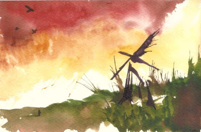
Overall I've painted 119 watercols so far for this. I had to be quick and this meant that some were better than others but generally I got better as I did more. Sometimes I erred on the side of simplicity, like "I Want to be a Windmill" here, where I decided to "splot" the windmill shape instead of aim for something exact. The more exact I aimed for, the harder things got.

I also used my general philosophy of it's not how well you paint, but what you paint that matters. The poem "Clifftop" is about two people running over grass and leaping off a cliff, and then flying, a relationship allegory. That image is good enough alone. It doesn't matter how well it's painted, or how fine the words are, providing you've conveyed that basic story, it will do.

After the paintings were done I scanned them in and put them into the book; 400 pages. I looked up the price and found out that it would cost over £50 (inc. postage) to print one copy. I knew it would be expensive. I had several options but my plan now is to print two editions, one cheaper paperback in monochrome and one hardback in full colour. The hardback would cost £100 and be limited to 100 copies. That fact made me want to add more to it, more colour, more illustrations to make it a unique poetry book. Uniquely beautiful, precious, expensive, a work of art in itself in equal to any painting or print of that price.

As such I decided to add at least a background to every page. Then I painted 12 new full-page illustrations for each month (there is one poem per day for a year in the book, so each chapter is a "month"). Then I painted 64 new illustrations that are simple ink blots of colour to accompany some of the other poems. Those are the closest thing to abstract expressionist paintings I've ever done! See...

But I've tried to relate each one to the poem too, reading through as I painted. One main aim was to make it bright and intense so that the full colour book was as bright and wonderful as possible. I'm hosting a poetry night in April so I want to have at least one copy ready for then. That gives me a tight deadline. I'll keep adding content until the last minute and then print a copy, and a few monochrome ones.

I'm starting to feel like a proper artist now. In other news I'm having a meeting on Monday with some art students at the local university campus. I want to design and stage a performance to accompany my Love Symphony; which itself will be released on Tuesday, and I've just finished my first oil painting of the year too; Prometheus as a Turkey Being Eaten by a Peacock.

So, doing lots is one reason why my blog entries are long these days. I should try to make them shorter. I know it would be easier to read and that more people would. Thank you for getting this far. I suppose if I knew more people in my life who were interested in my art I'd talk to them instead of typing my thoughts to the Internet. Perhaps I'd make less art too, not needing to communicate to "everyone". But who can say. I have many special friends, and I'll be going to Birmingham Museum with the closest one tomorrow, but my Valentine this year will be art, and I'm as filled with as much love for it as ever.

I'll end this post with a poem from the book.

The Fragile Rose

The rolling ocean
swells and flows.
The cold rain falls
upon the rose.
The rising water on her neck.
She raises arms to distant skies.
Friends flock and fly,
swarm and chatter far away.
The fragile flower breathes the day,
and seeks escape, a path to follow,
but all she can do is avoid the sea,
and wait to avoid it again tomorrow.

Friday, February 03, 2012

What Makes a Reject

Don Michael Jr. made a comment about who and why some of my illustrations were rejected so I thought I'd share a few "before" and "after" points.

Some pictures were a bit blurry or had drips or mistakes that can occur with watercolours. I wasn't too fussy about these if they made interesting shapes, and in fact I like the effect of shapes like that, but sometimes the paintings blurred a bit overnight in unexpected ways, which made me decide to paint them again. Here is the first illustration for a poem called New Buds...

It's okay generally but rather blurry, and the main plant has leaked so much into the background that a lot of definition was lost, so I decided to crisp it up a bit, but generally repaint the same scene, here...

For others, I decided that I didn't like the concept as much. A poem called Drowning in Touch initially involved an embrace of many colours...

Ignore the red spot in the top right, that wasn't there when I first finished! I quite like the fragmented black blob, which came from the shellac ink; much nicer than watercolour black. When repainting though I wanted to try and convey touch in more ways and at least make the couple seem more realistic.

The poem is about two people entwined in embrace and it made me think of two spirals and so the second illustration fitted the poem better, I think.

I've pained about 50 of these so far and have about another 50 to go. I'll be hosting a poetry event in Crewe on April 23rd, so now I have an event to show people the book at. Poets tend to be the poorest of artists. Poetry books don't sell brilliantly and poetry books are printed cheaply to be sold cheaply. I can't really afford that; I aim to use Blurb and I either print everything in full colour or everything in black and white, so if I choose colour I might as well put colour on every page and make something impressive and valuable. If it costs £50 a copy then the people who buy it will treasure it. That at least is true.

I've been looking again at William Blake's Songs of Innocence and Songs of Experience; the book of two parts he printed and hand painted in the 1790's. He only sold less than 30 copies in his lifetime; but did that matter to him or to art? I hope not. I hope that he knew that the beautiful book he worked so hard on back then would one day be re-printed easily and in thousands so that 220 years later, ordinary people like me can own a copy and love it. I make my art with that same faith and the same sure knowledge.