
A trip to Macclesfield in the morning for some photos to announce the Liza Minnelli portrait donation to Barnardo's:

After that, some work on the Cromwell frame. I did a few tests first and liked the darkness of a thin black base with brown stain on top. I decided to powder the result with rottenstone which gives it an ancient appearance... it changed it so dramatically that I wasn't sure about it. I met a watercolour artist at Barnardo's who spoke the old axiom that watercolour painting is about choosing when to stop. I've never really had that problem with painting, I make a plan, paint it, and when finished, it is done, but with this frame this is an issue... I could remove some stone, I could distress it more...
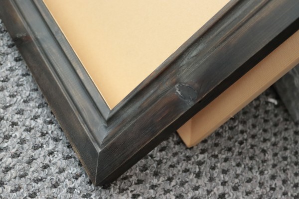
...but it does look 'farmhouse 17th century' which is the effect I wanted. I realised that a key philosophy with a frame it to key things down; make the decoration more neutral and even.
After that I started work on the second edtion of The Many Beautiful Worlds of Death. I wrote this is 2012, my first major writing, but I've certainly improved as a writer since, and reading back some of this I can see clear changes, and of course Deborah's qualified eye has helped fanstastically. Some lines sound funny, even though I liked them, perhaps for that very effect; "he blinked a slow, pink blink"... that one will go, but many will stay... I don't want to spoil the novel's character. One oddness is that the font has big differences between ; and : - the colon is so tiny it's almost invisible and the semicolon is rather large and proud. I'm torn between usign a different font just for these, though that makes the formatting uneven and complex to edit.
