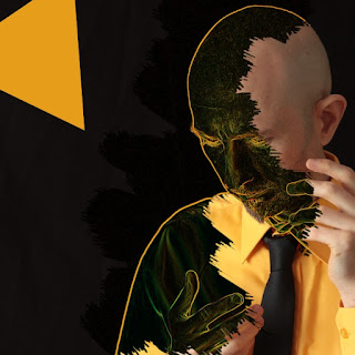
Long day working on cover art for Secret Electric Sorcery. These days I tend to design an 8-page 12cm sized 'booklet' for CD, even though hardly anyone uses CDs anymore - I still like a physical format, so will remain persistent.
I took some photos a few weeks ago, and wanted an orange/black/white colour sceme, so that was easy. The hard part is making things look a little organic. I've not drawn on these (unlike with Sisyphus) but have designed 8 pages and a front and back, which is good going for one day. Things will tweak and change. Here is the cover so far:
The swirl effect on the cover was generated using Genetica, a great tool which is a bit like a graphical version of my music software. This page looks particularly interesting, somewhat electronic:
One concern is that the work is starting to look similar to past album covers - of course, this will happen anyway, and, of course, nothing will be identical. Enya's albums all look similar, as do Enigma's. I've used orange and white in Music of Poetic Objects, and have used the scribbly face parts in the internal covers of Tree of Keys. For a technological looking cover, the music is perhaps my least electronic, but the inspiration for the cover comes from Bowie's Low, and my music does have a similar feeling to that.
To make things more organic I've added some tree images from Queen's Park. This page is interesting because it has the same look as Greek pottery:
I've also managed to fit all of the song lyrics in the booklet for the first time. Any text is difficult because I must use bitmaps, not PDF files with embedded text, so the resolution and print quality is limited. Looking at Pink Floyd's The Wall artwork today reminded me that their lyrics are also images (though very clean, perhaps they are also splines).


