
Dropped off books to Nantwich Museum yesterday. Still annoyed that 18 of the 34 books delivered by Amazon were printed badly and need replacements, but 6 have been posted away so I can't return them. I have returned 11 to Amazon, but haven't been refunded enough money to order 11 correct replacements, and after many emails I'm not getting any response from their customer support. I've been using Amazon for publishing successfully for many years, and have never had a problem with their support system, or a serious problem with print quality. Now, at this first problem, the customer support is exceptionally bad.
In between I've been working on the Heart of Snow artwork. This has taken a lot of time and work. As I've got faster at some jobs, I not do more and more, create more and more options to choose the best. I read that one of Beethoven's last quartets had over 60 different sketches before he settled on the final one. This is exactly how things are. I've taken lots of photos of Hail Mary, the name for Deb's Christmas tree, and used some of those. I've taken photos of myself in with my 'snow' look, and, yesterday, wrote out the lyrics in pen and ink and drew some drawings. I've also created a new snowflake brush in Photoshop, so a lot of source material.
Here is one lyric sheet:

And my final draft (so far) of Page 2:
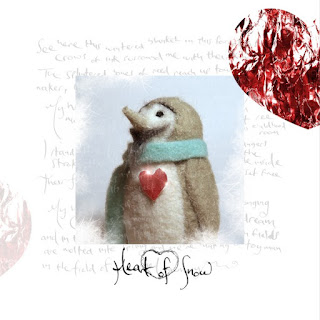
I started with the simple penguin object photo (actually a felt penguin, I added the beard myself with my felting needles). I added some white frosty snowflakes around its periphery. On its own it looked a little plain. This would be fine for one page, but I had the idea of one page for each song, and many like that were rather empty looking. I experimented with the plain lyrics, but, again, all plain text looked a little too messy, the text is legible, but only just, and many pages of it looked a little simplistic, spidery, and a bit of a waste of colour printing.
I tried combining the two in many ways, and tried adding type-written text, but the typed letters looked far too rigid and 'digital', like a cheap greetings card. So, I layered the text in many ways, colourful, plain, inverted, complex. Some obscuring or interacting with the image inside, some not.
I made up images for each song, taken from the tree photos:

Then added the faint grey text, as seen here, which seemed to balance the look, though not as utilitarian, as the words are sometimes impossible to read, so designed more as a feeling with hints of truth, or things to discover. I created the red heart to add something to the white edge and added these.
So this is the stage so far, but there are many options. I like the ink drawn writing. In aesthetics, its often about feeling, the balance of order and chaos; is there too much order? Too much chaos? Just as I like the production style of Bowie's favoured producer, Tony Visconti, I like the visual style of his latter-era album artist, Jonathan Barnbrook.
Productivity aside I'm generally in a slow and tired mood, but I must remind myself that steadily doing things for hours is what work is, so if this is being done, then this is a measure of productivity rather than quantities of outcomes. Most of the actual music is complete. I burned a test CD of Heart of Snow today for a final audio-proof. There is always a lot to do on each album now; this art, Spotify Canvases, lyric reading videos, the essential filing and music administration, and none of that is publicity or any of that which I have always disliked and shun.
