A full and tiring day today. I started by re-examining my 16-bit dither algorithm, my >=-1 and <=1 random number generator. I reasoned that if a sample was in the exact centre of where it should be, it should never dither up or down, so I had the idea of limiting it to >-1 and <1, but this is a bit of a pain, as it involves an extra addition (ie. slight speed loss) to the seed value before taking a modulo.
I spent hours this morning experimenting with different random seeds and ways of mashing the numbers to generate a 'most random' result, but they seemed to work about the same. The values I'm working with here are miniscule, the width of one 16-bit sample (so 1/32767) and it's quite hard to examine such numbers. I discovered a bug in SoundForge where the sample graph display breaks down when showing a 3-minute sample of these tiny numbers. My >-1 and <1 algorithm should have worked but it's hard to test... the statistics show that some numbers were 0.000015259 - this is the =1 or =-1 result BUT it might have been less than 0.00001525925... I couldn't be sure because the number of decimal places in SoundForge isn't high enough. I decided to fix it by using the >=-1 and <=1 algorithm and simple multiply by less than 0.5 to shrink it a -tiny- bit from the edges.
Working and worrying about these tiny details can cause insanity.
Then I started on the Salome artwork. I probably work too hard on a full 8-page CD booklet for my albums when then odds of printing and selling any CDs is so poor - but in this case we almost certainly will print some. I still love CDs and jewel cases, and can't stand the cheap cardboard cases that seem to be the norm these days. Even the wonderful artwork of Bjork's Utopia (which is, if anything, better than the badly mastered and sadly distorted music) went in the bin due to the impractical shape. I care about CDs, I don't want them scraping along the sides of a cheap piece of cardboard.
As an artist, I sigh and wonder why I put so many day of my life into meticulous artwork designs for CDs that will remain unsold, unseen, and unheard, but, such is art. I must still do my best and push for better each time; this is art not commerce. How many people see my paintings in real life? Not enough, but some do.
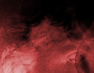
The cover was easy, I wanted to use the poster design, but it needed a contrasting colour. The red on the poster really helped. I experimented with a green shard, like the shaft of a daisy for the 'o' in Salome, but later used a red heart:
Hearts were used on the inside cover, I decided to use a spiralling still from the Cosmic Solitude video:
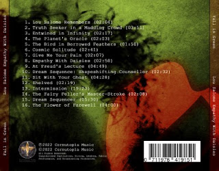
Most of the inner pages are the yellow, transparent smoke, colour from the cover. The get the same granulated effect, I used different fragments from the source photos and blew them up, then layered them to create lots of interesting results. I wanted a contrasting colour on the back. I thought green, partly because the similarly hued The Myth of Sisyphus used blue... so I wanted something different. The result is how I imagined:
The red symbol from the cover, almost a kiss, really helps. I rather like this strange, floral, rosy, result, but I'm not sure if it matches the feeling of the music. These are all first drafts, early days yet.
Generally the colours are bold: bright sallow yellows, dark greens, dark reds, that is all. I've sketched out 10 pages so far. A busy day.
I must finish the music editing and general sound, and this artwork. I'm tired, I feel Sisyphean again, but I must keep pushing this rock no matter how exhausted I feel. Tempus est pretiosum. Vita brevis.


